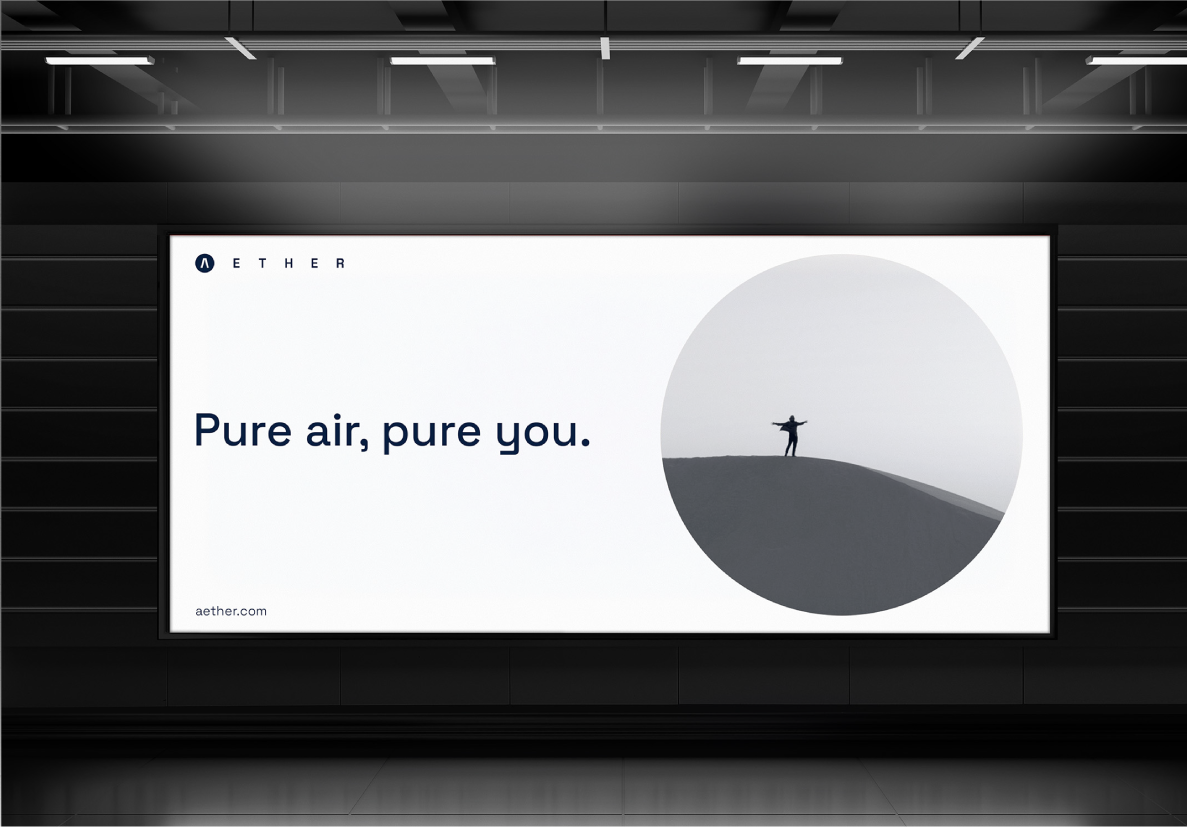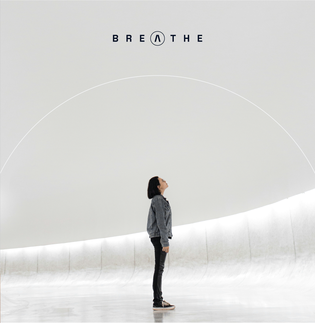

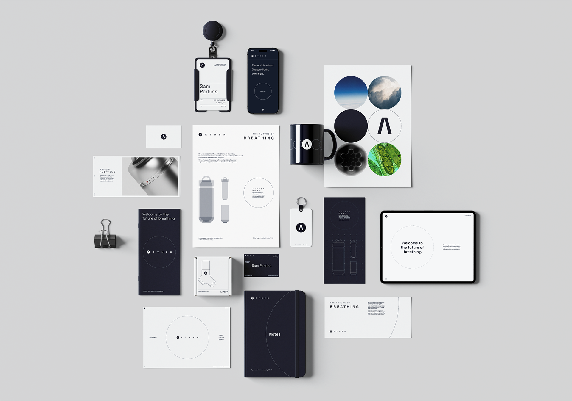
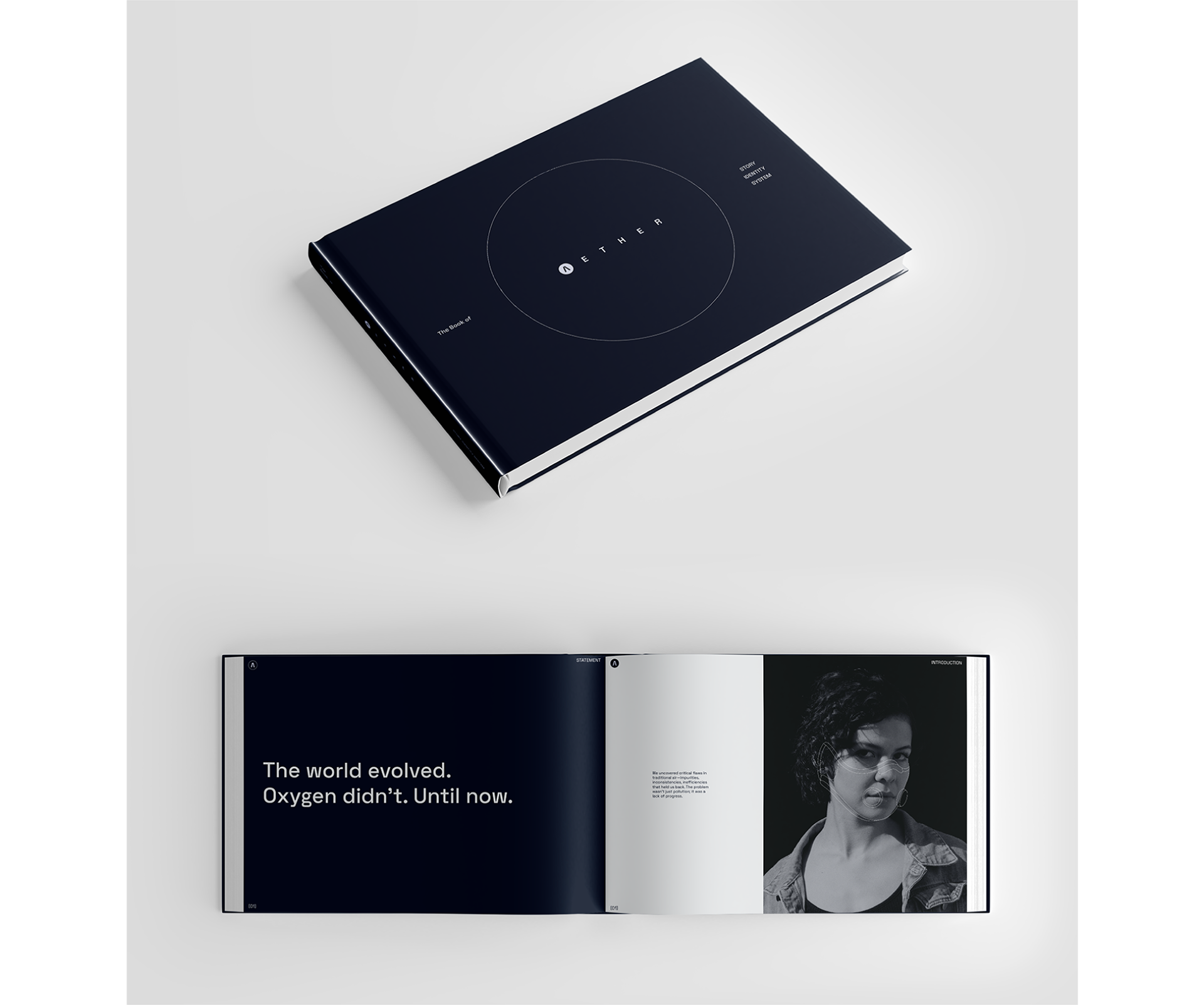
Aether is a fictional brand that sells “precision-engineered oxygen” as if it were the next luxury tech product. Born from a love of design systems, storytelling, and satire, this project was my way of pushing branding to an absurd extreme and treating that absurdity with complete seriousness.
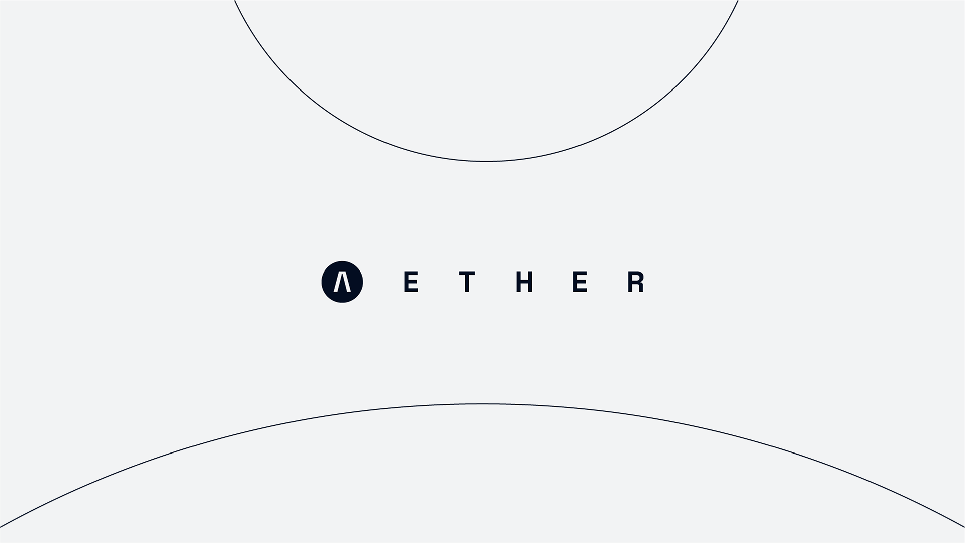
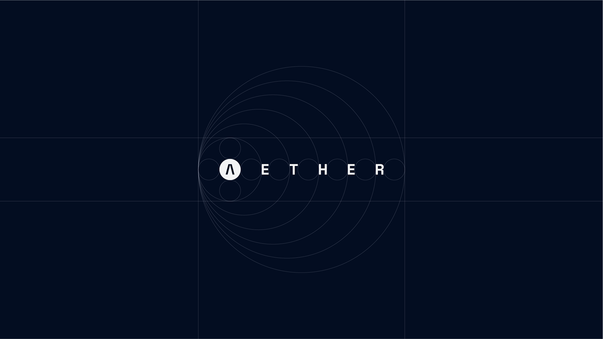
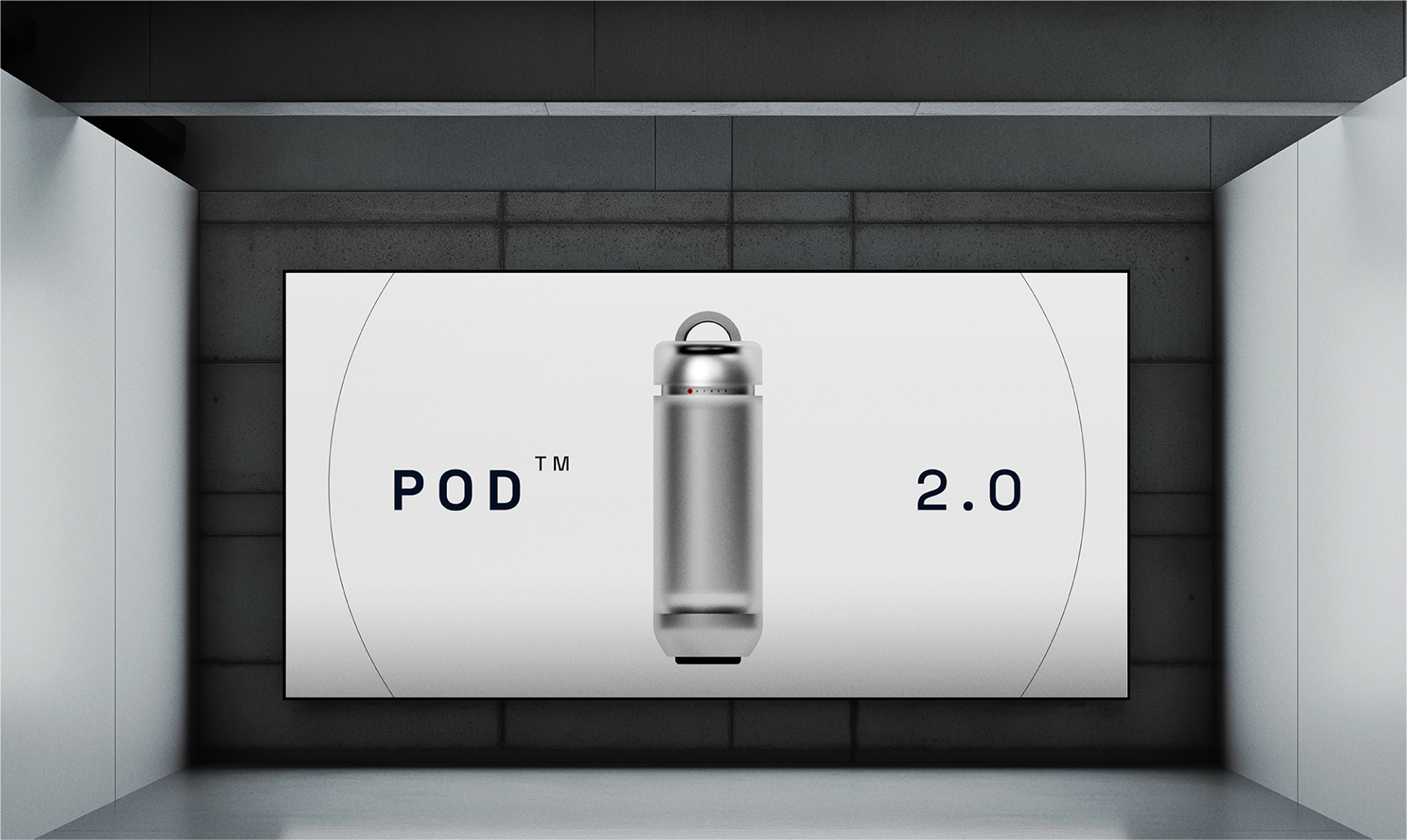
It started as a fun idea: What if oxygen was sold as an apple product? From there, I developed a full identity logo, design principles, tone of voice, and even some 3D designs and renders of one of the products. All anchored around The Quark, a circle form representing molecular perfection, balance, and breath.
I used this project to experiment with voice, minimalism, restraint, structured branding, and visual storytelling. Aether was a way to explore how design can shape belief, even when the product is literally just air.
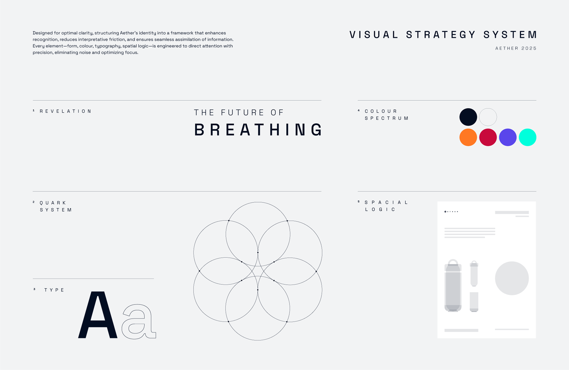

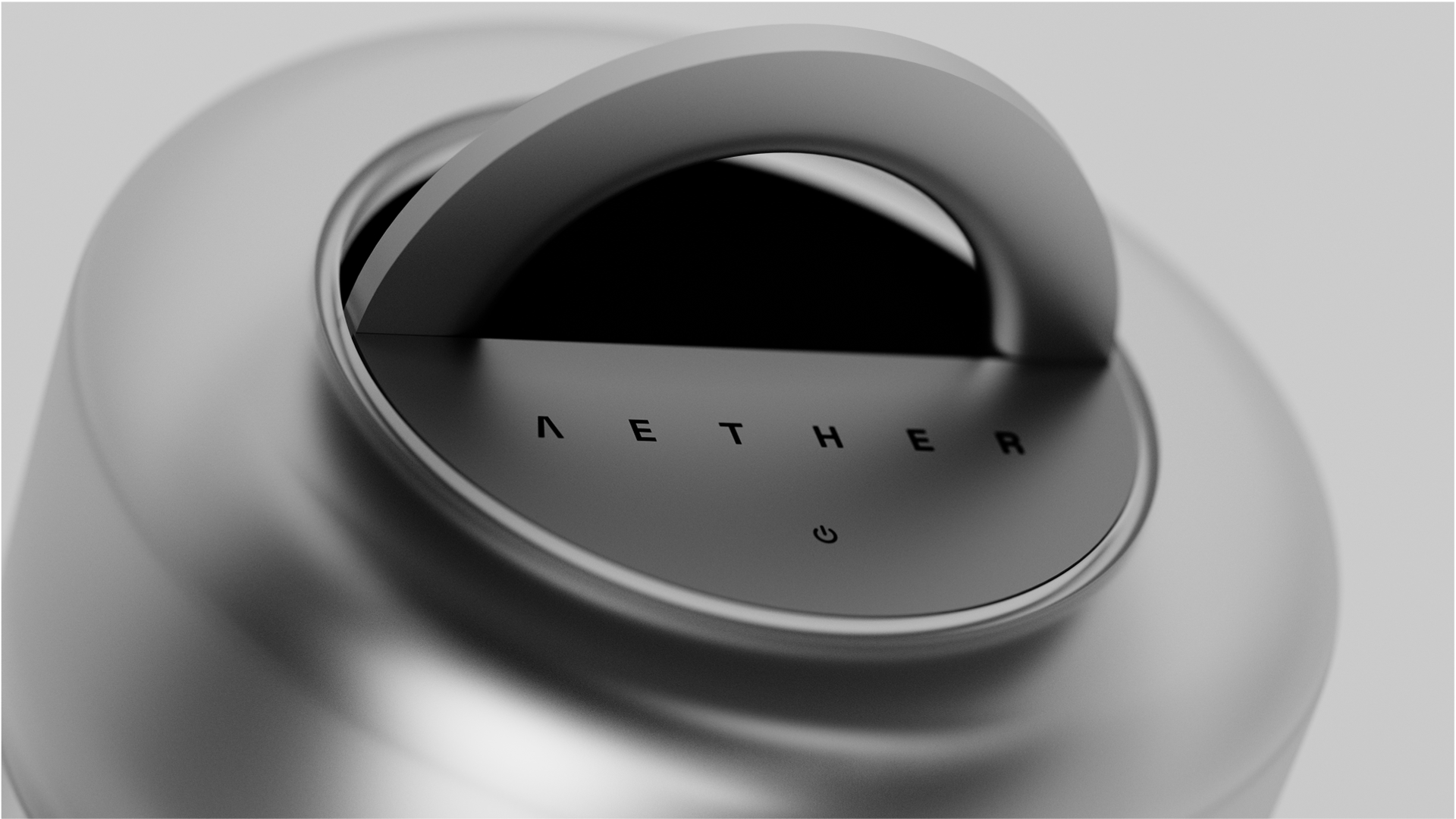
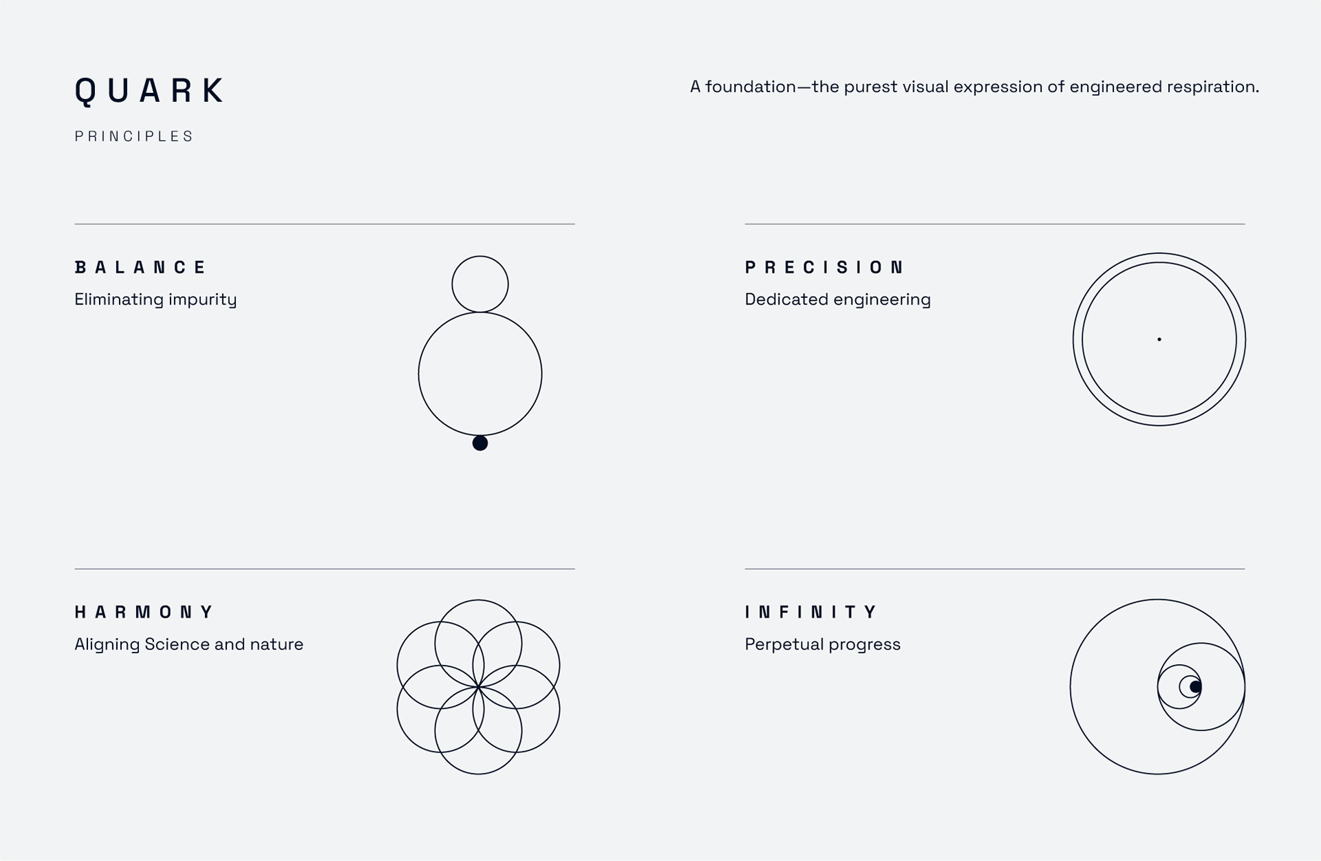
QUARK
Quark represents Aether’s core philosophy that oxygen is no longer just a natural element, but an engineered product.
It is the visual symbol of molecular precision, embodying Aether’s perfected oxygen structure.
It reinforces Aether’s scientific and high-tech authority the brand’s identity at its most fundamental level.